A Look Inside Sanofi’s New Budapest Office
| May 8, 2021Healthcare company Sanofi recently hired architecture and interior design firm LAB5 architects to design their new office in Budapest, Hungary.
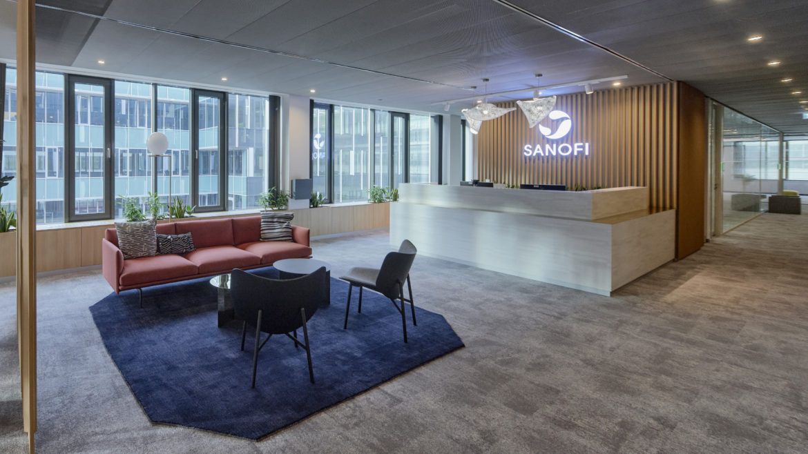
“The concept represents the main attractions of Budapest, seen both by tourists and locals. These conceptual “sceneries” serve two functions, first they are giving colourful atmosphere for the interiors, second, they are helping the orientation on the area of 3.500 m2. Parliament Exterior and interior finishing materials and architectural motives of the Parliament building is evoked in the reception area. Vivid colours on carpets and pieces of furniture resemble the original red and blue carpets, yellow brass and wood finishes. They are accompanied with opal shaded lighting fixtures.
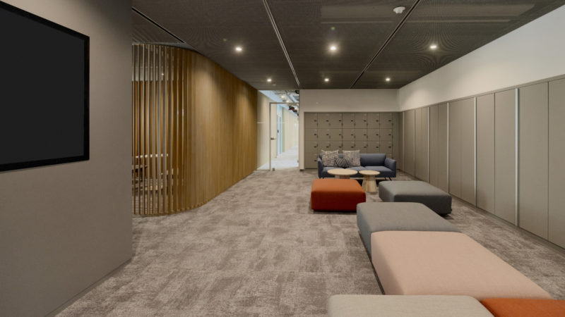
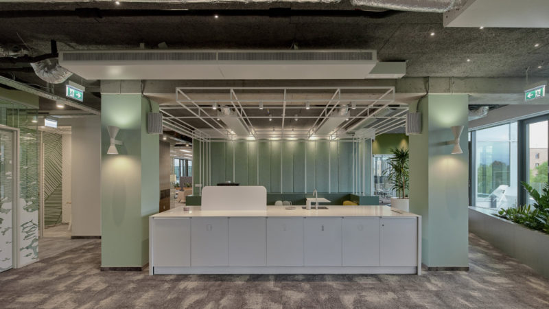
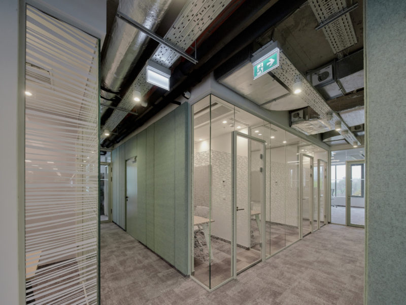
A graphical hint joins the pattern of the openable glazed walls of the board rooms, inspired by the architectural façade features of the gothic lancet windows. Buda Castle The image of the Buda Castle can be seen in the space of the work café, that is an area opening from the reception. Pastel mortal façade colours are seen on the walls and furnishing. Natural stone and patinated copper are characteristic in the Castle, so they are used on the floor – with bright green kitchen counter. The graphic design of the glass wall is following the organic ornamented motives of the Fisherman’s Bastion, strengthen by the white, broken stone imitation on the floor. Gellért Mountain The main functions of the Community Centre are relaxation and get-togethers, so we used the natural image of the spectacular mountain. The two main characters, rocky peaks and green filled sides both appear in this area. The rock itself becomes a stepped podium, embraced by the green.
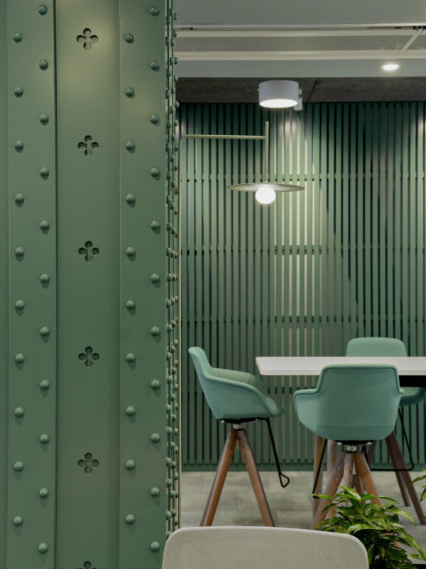
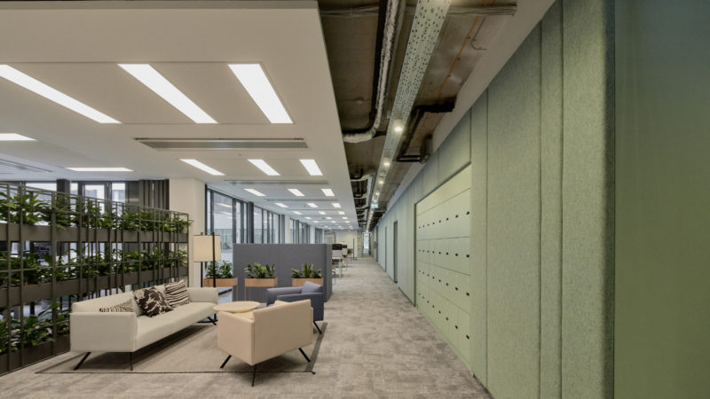
The kiosk is the main element of this recreation zone, works as a trellis pavilion of the Centre. The glazed wall pattern design imitates the graphic details of the plants and rocks. Elisabeth Bridge There are two identic open office areas in the space, both shaped as bridges, Elisabeth and Liberty. Floors, walls, main furnishing are in monochromatic shades to evoke the clear white bridge of Elisabeth, and to contrast a bit as its asphalt pavement. The rivets come as details in focus, accompanied by the airy, lightsome lines, and paired with bold geometric patterns. Finishes of the columns are direct references to the columns of the bridge. Pastel mobile furniture and wall colours are evoking the summer sunlight. Liberty Bridge Carpets, walls, furnishing are dressed in the bright green colour of the bridge. Finishing of the columns are direct references to the bridge columns too, and the pale blue on the original surface behind them is the metaphor of the blue sky that can be seen standing on the bridge itself, looking through the structure. Graphic design of the glazed wall resembles the identical contour of the bridge.”
- Location: Budapest, Hungary
- Date completed: 2021
- Size: 37,673 square feet
- Design: LAB5 architects
- Photos: Zsolt Batár

The post A Look Inside Sanofi’s New Budapest Office appeared first on Officelovin'.

