A Look Inside Autodesk’s Sleek New Krakow Office
| November 21, 2020Software company Autodesk recenty hired architecture interior design firm The Design Group to design their new office in Krakow, Poland.
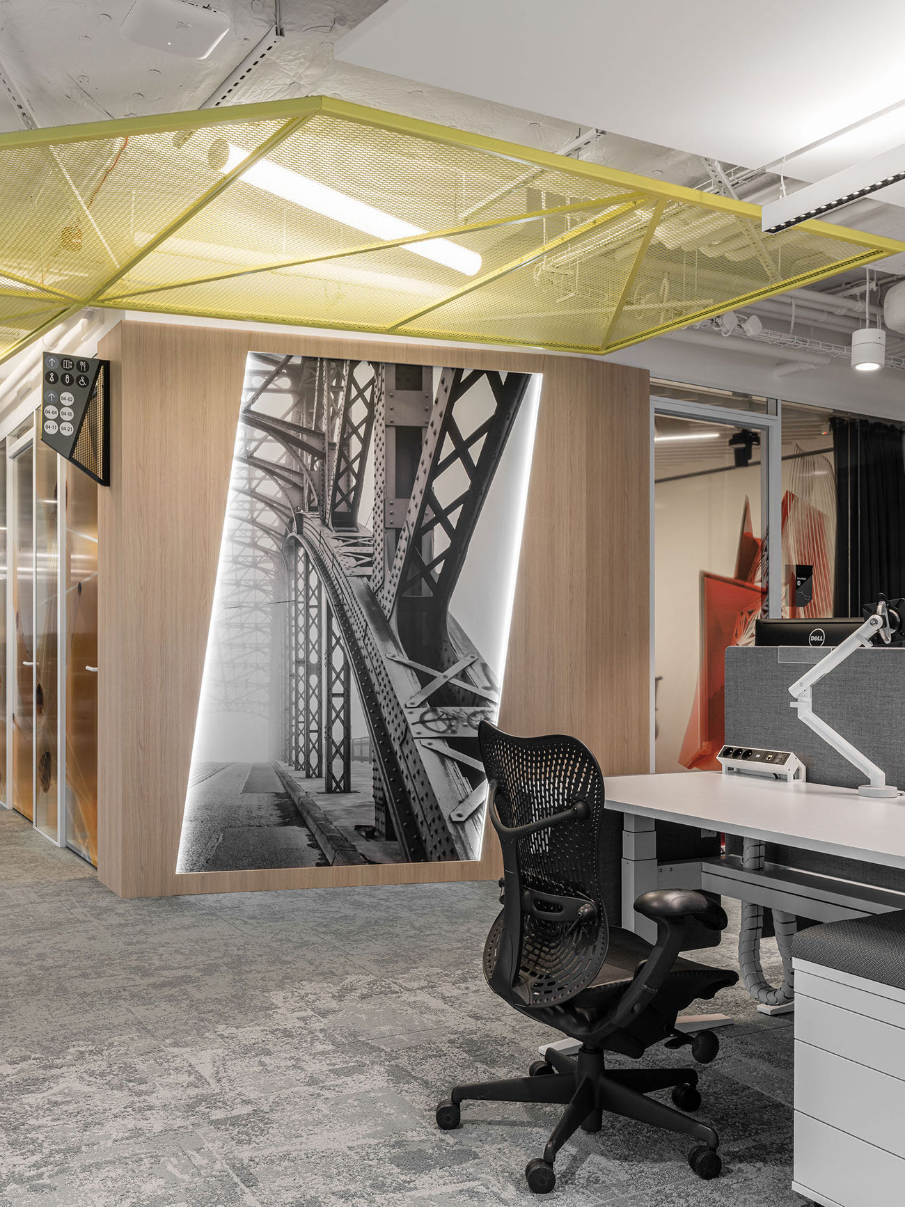
The original idea was to create interiors in industrial style, bright spaces and create a working atmosphere. The designers of The Design Group proposed a slight modification of the style, which was to the liking of the client. They describe it as modern industrial through the treatment of wood and vivid colors.
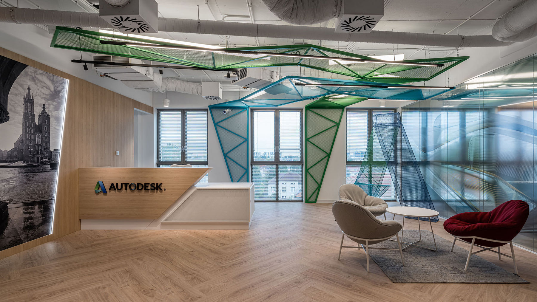
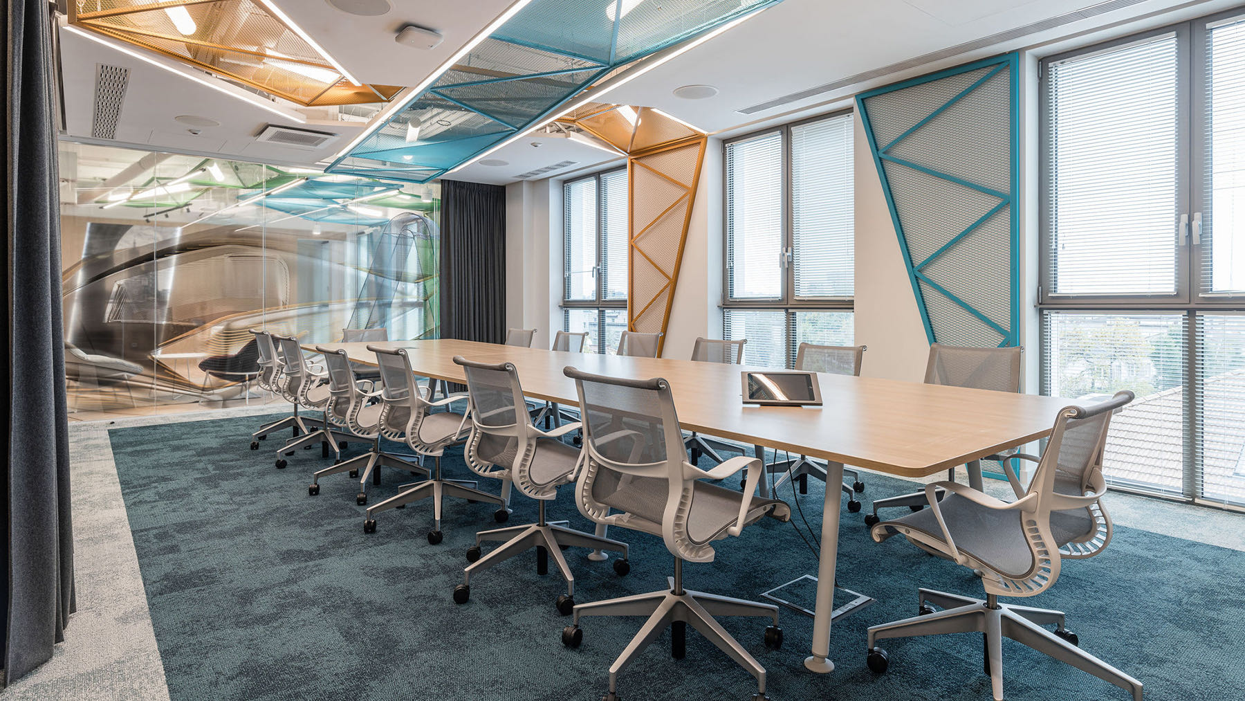
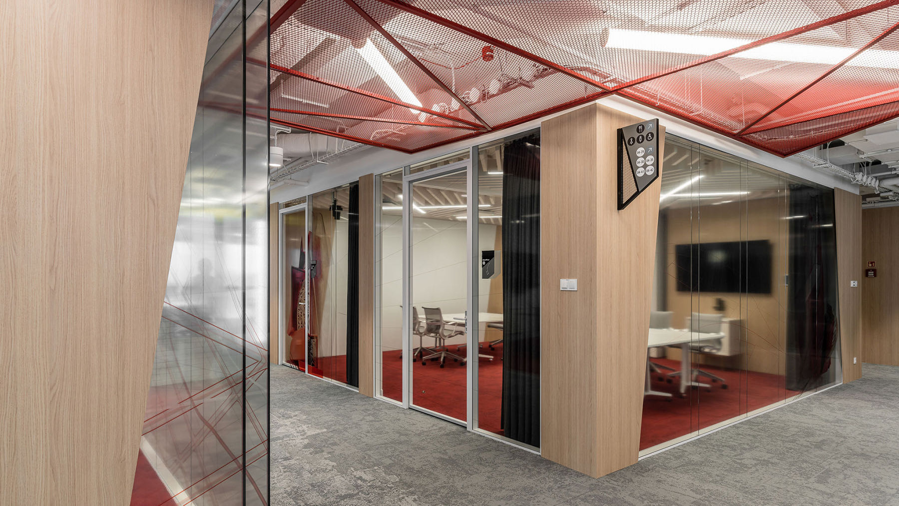
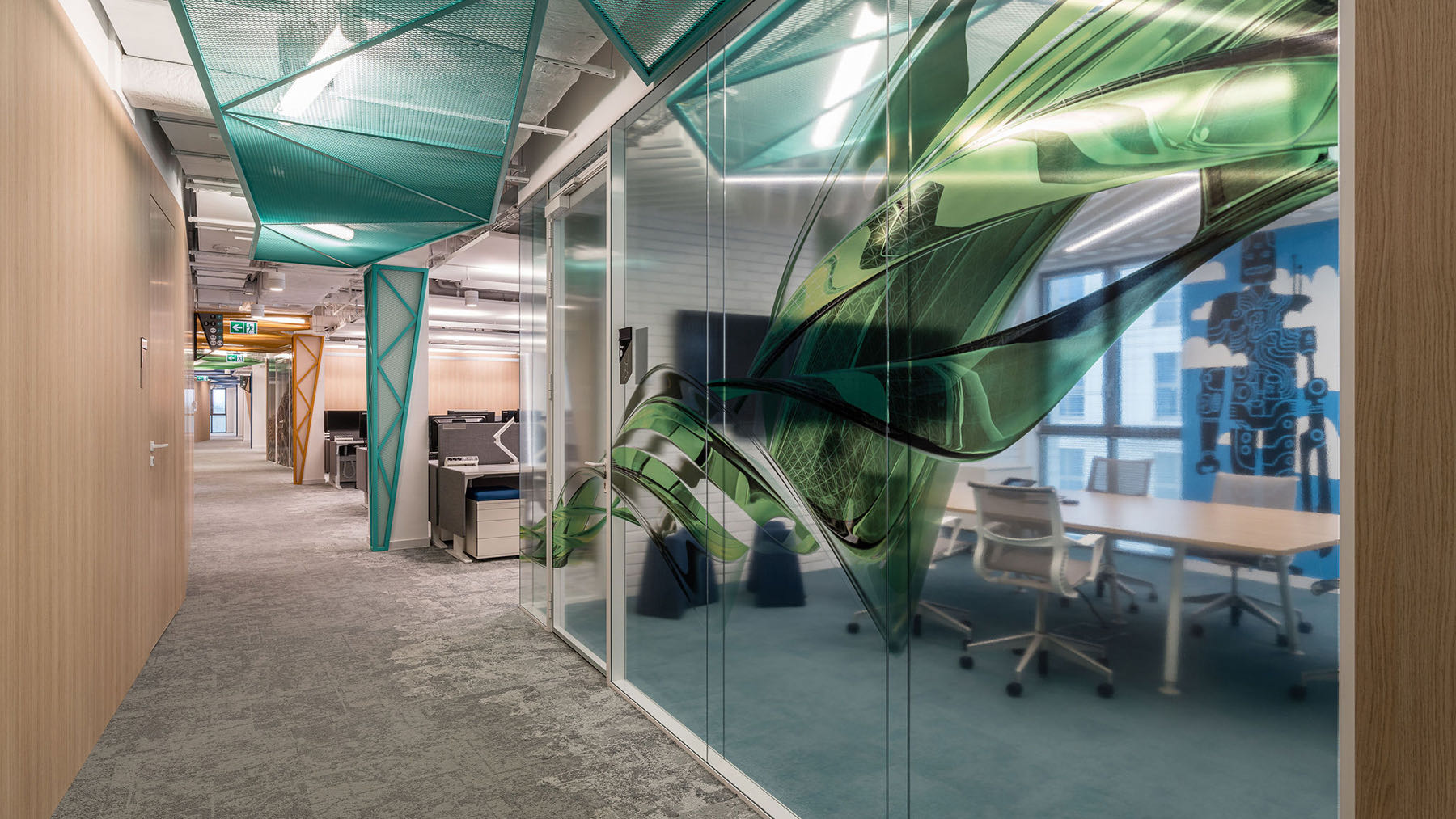
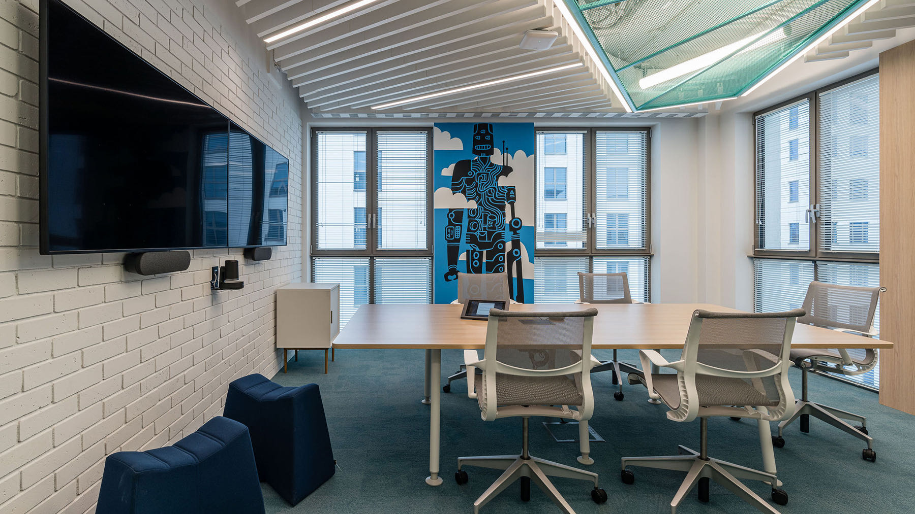
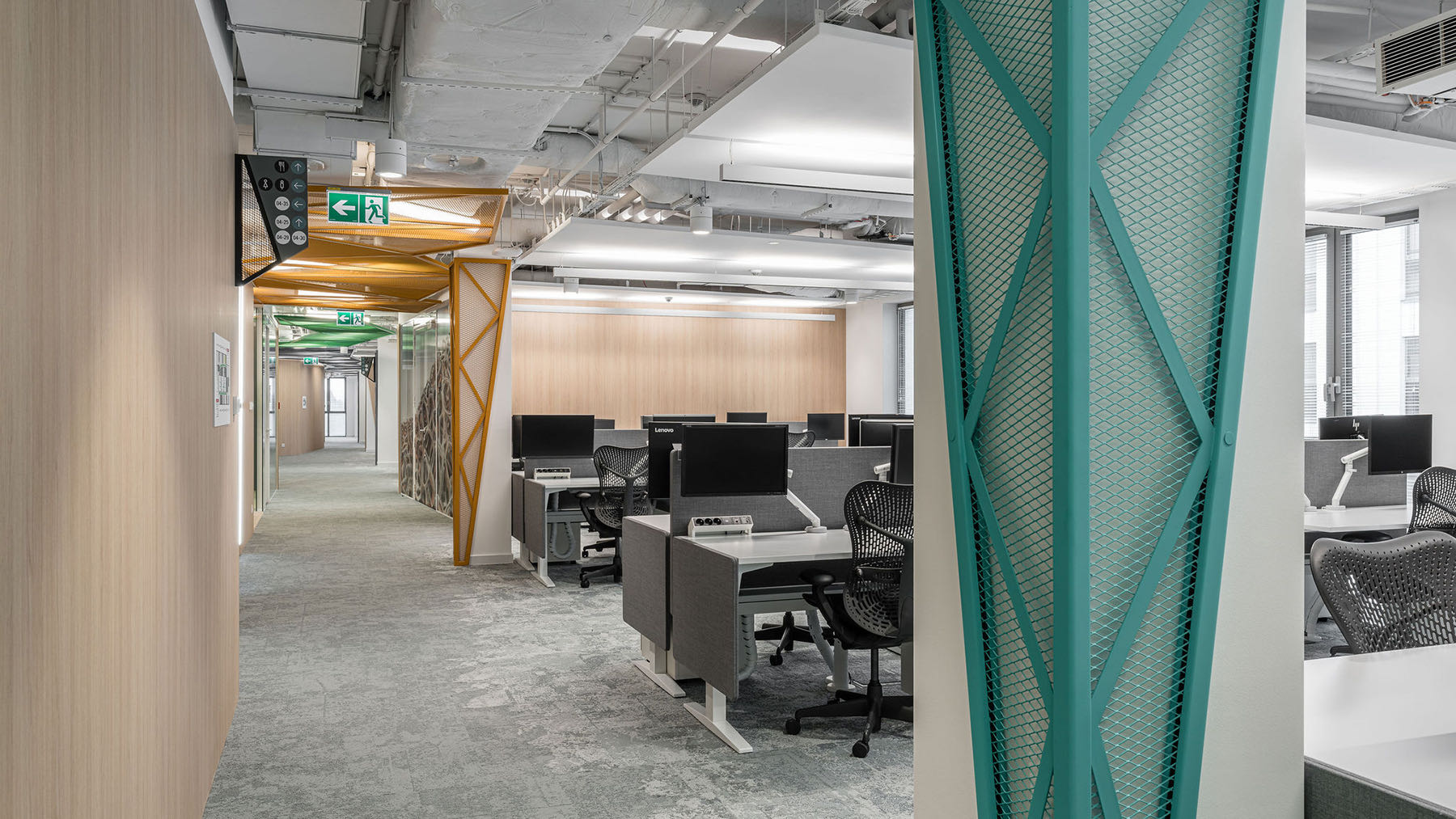
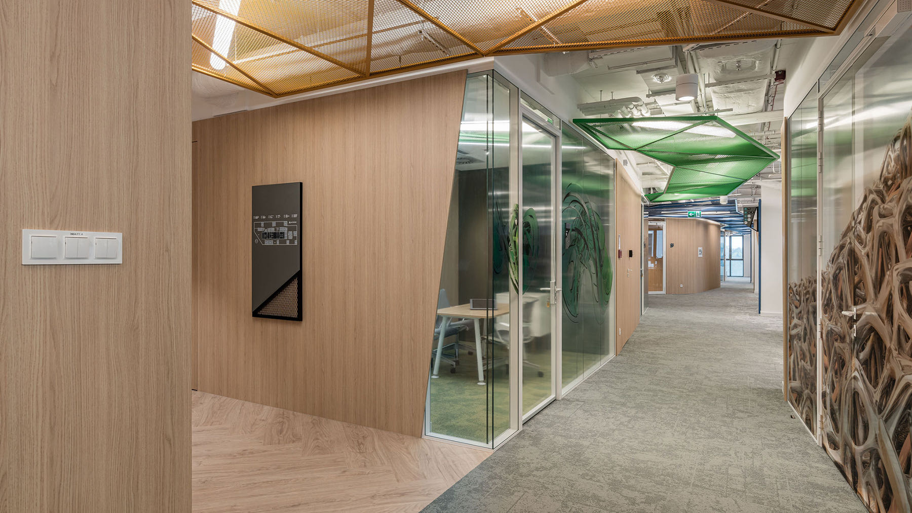
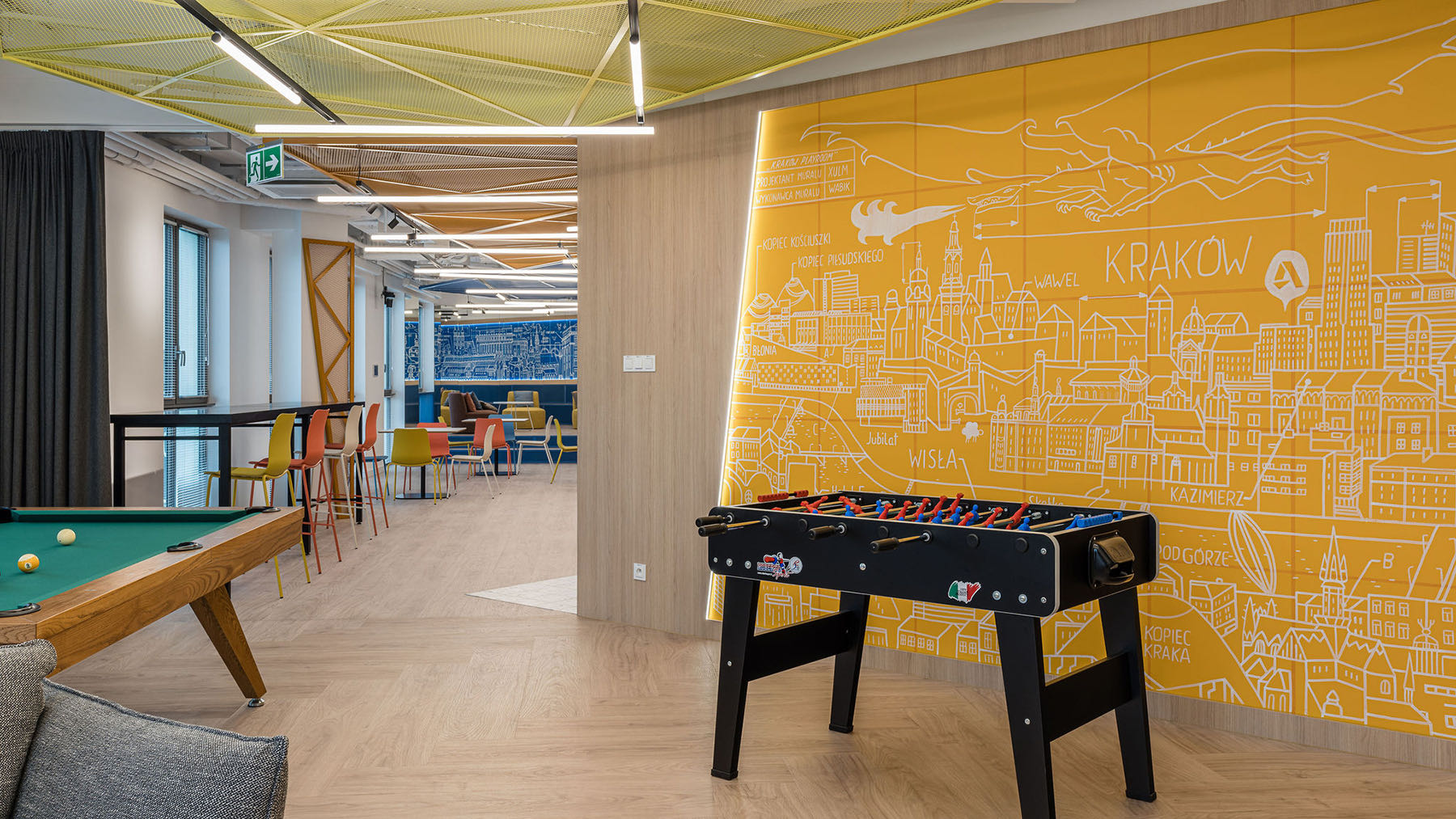
However, it all started with Autodesk’s own graphics, which the client sought to incorporate into their Krakow interior. Cut out on a special foil, they appeared on the glazing. In parallel, they imposed on the designers from The Design Group the colors of furniture and decorative, bent expanded metal (mesh) stretched on the ceilings and partly on the walls, too.
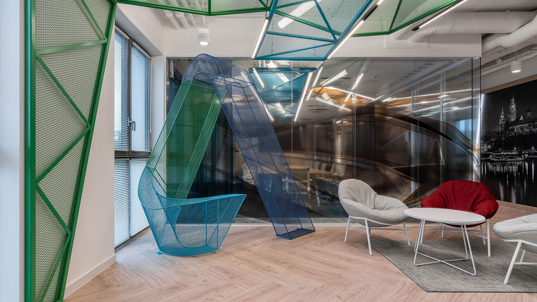
The foreshadowing of the color and style of Autodesk’s office appears already in the elevator hall. An interesting, three-dimensional structure, referring to Autodesk’s logotype, is made of mesh. The huge letter A reaches almost the ceiling and greets the employees and guests heading to the office.
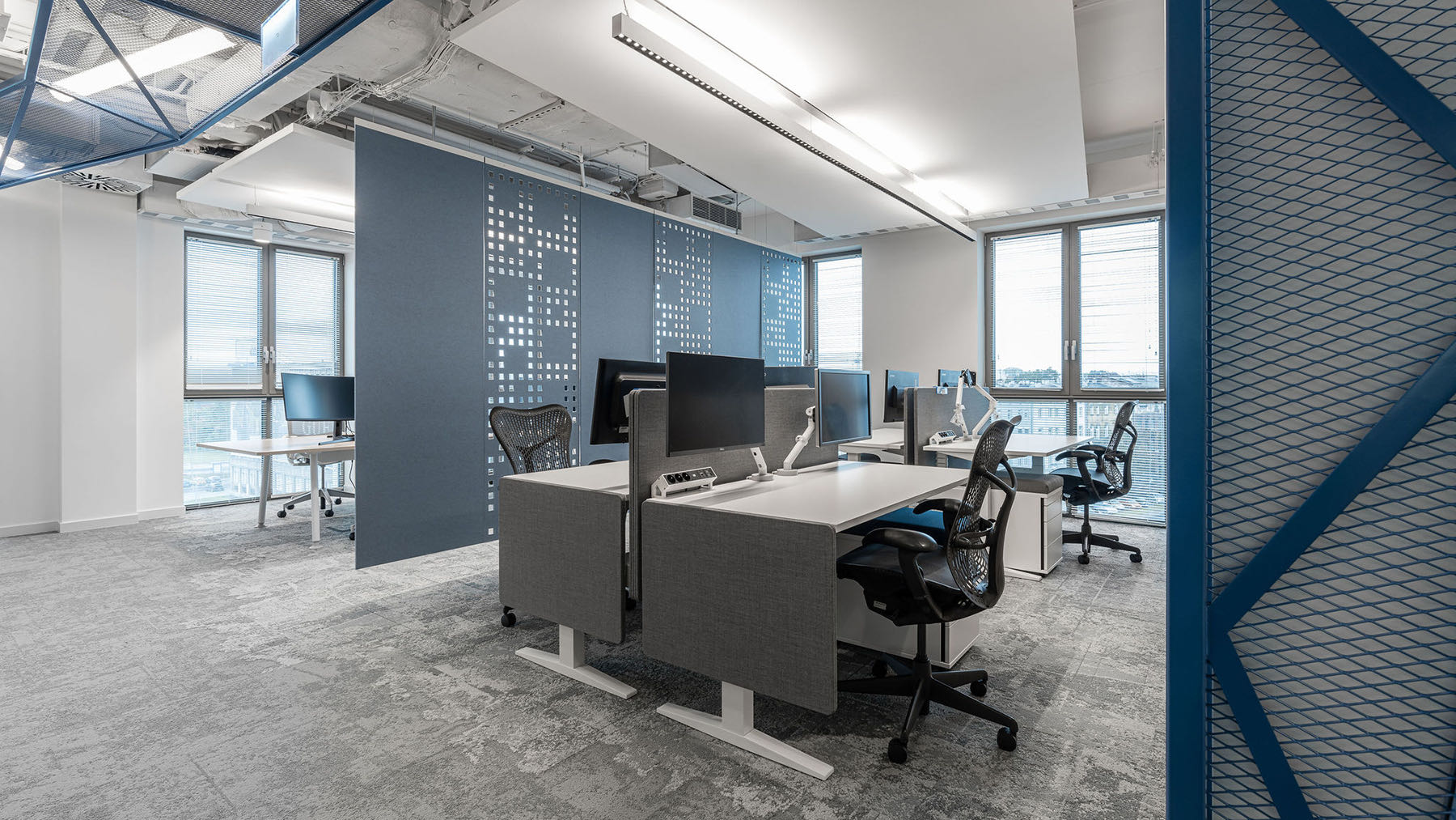
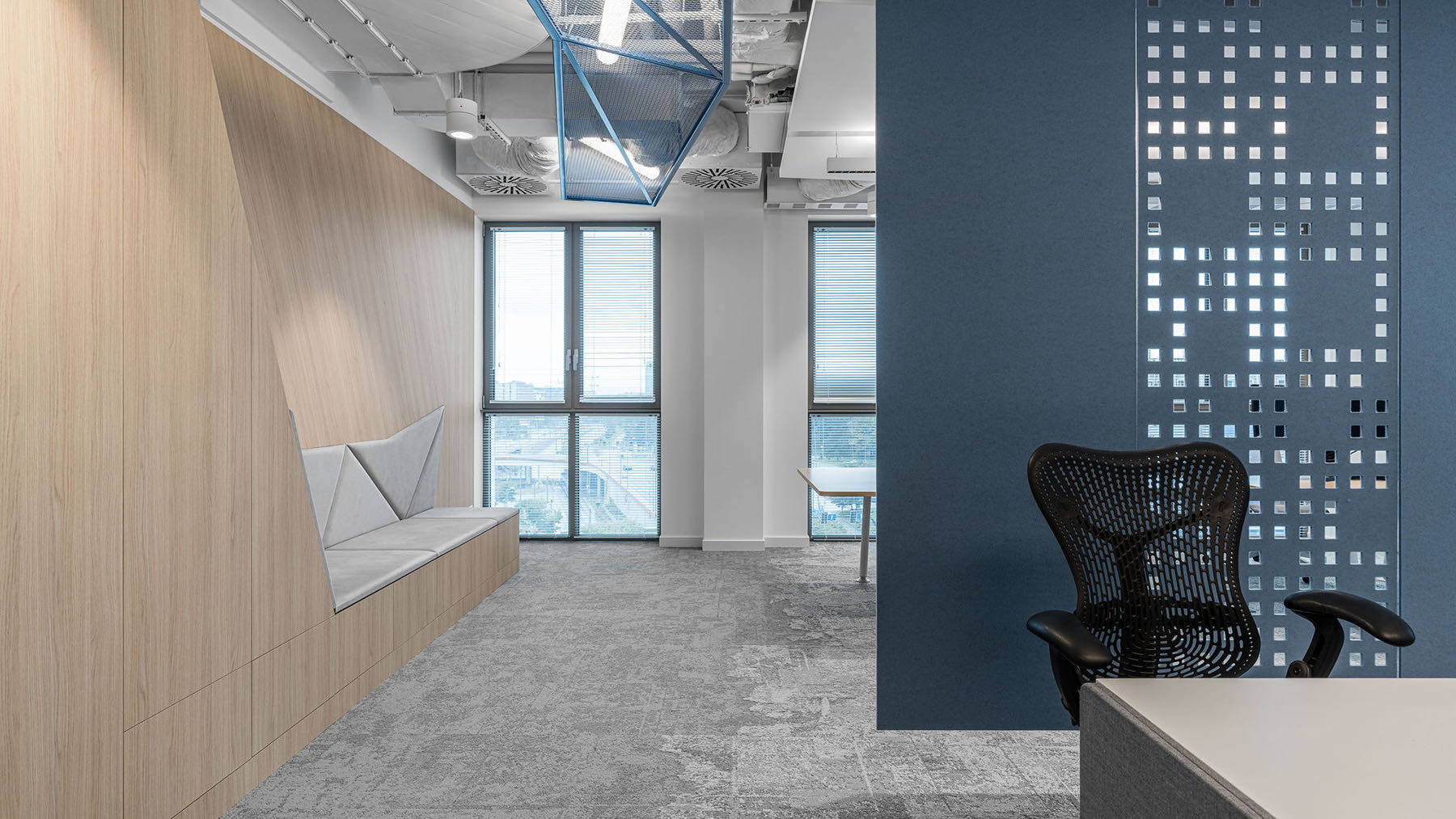
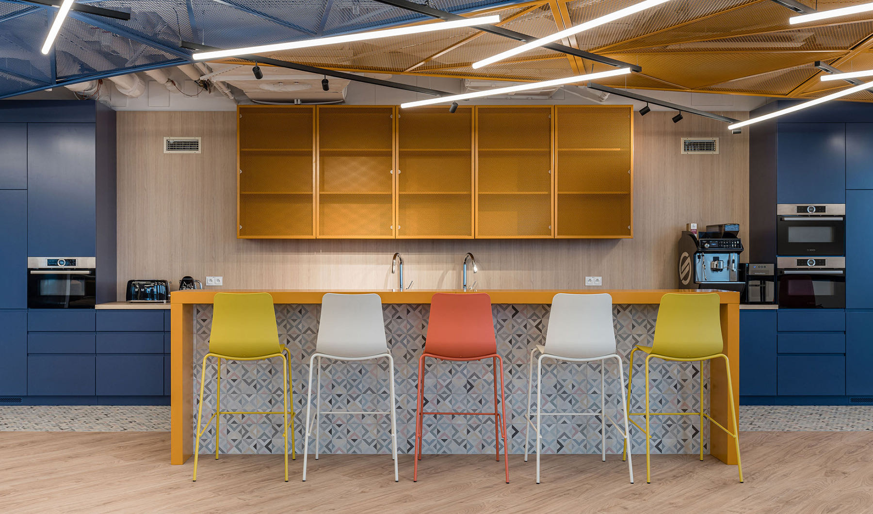
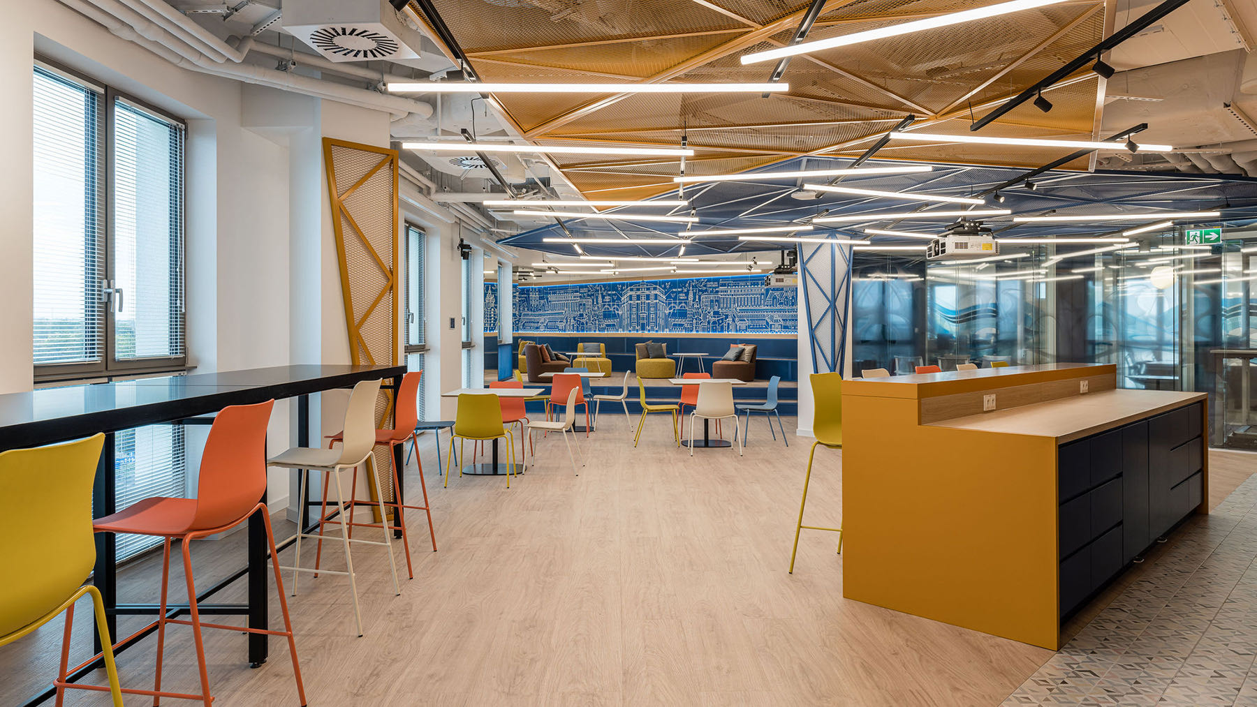
The famous Net Effect (as TDG designers call the use of meshes) has definitely become the leitmotif of the office and one of its curious elements. Vivid net colors and dynamic forms provide a flow of the positive energy indispensable for this place, while marking out individual zones to create an original and distinct space of the Krakow office.
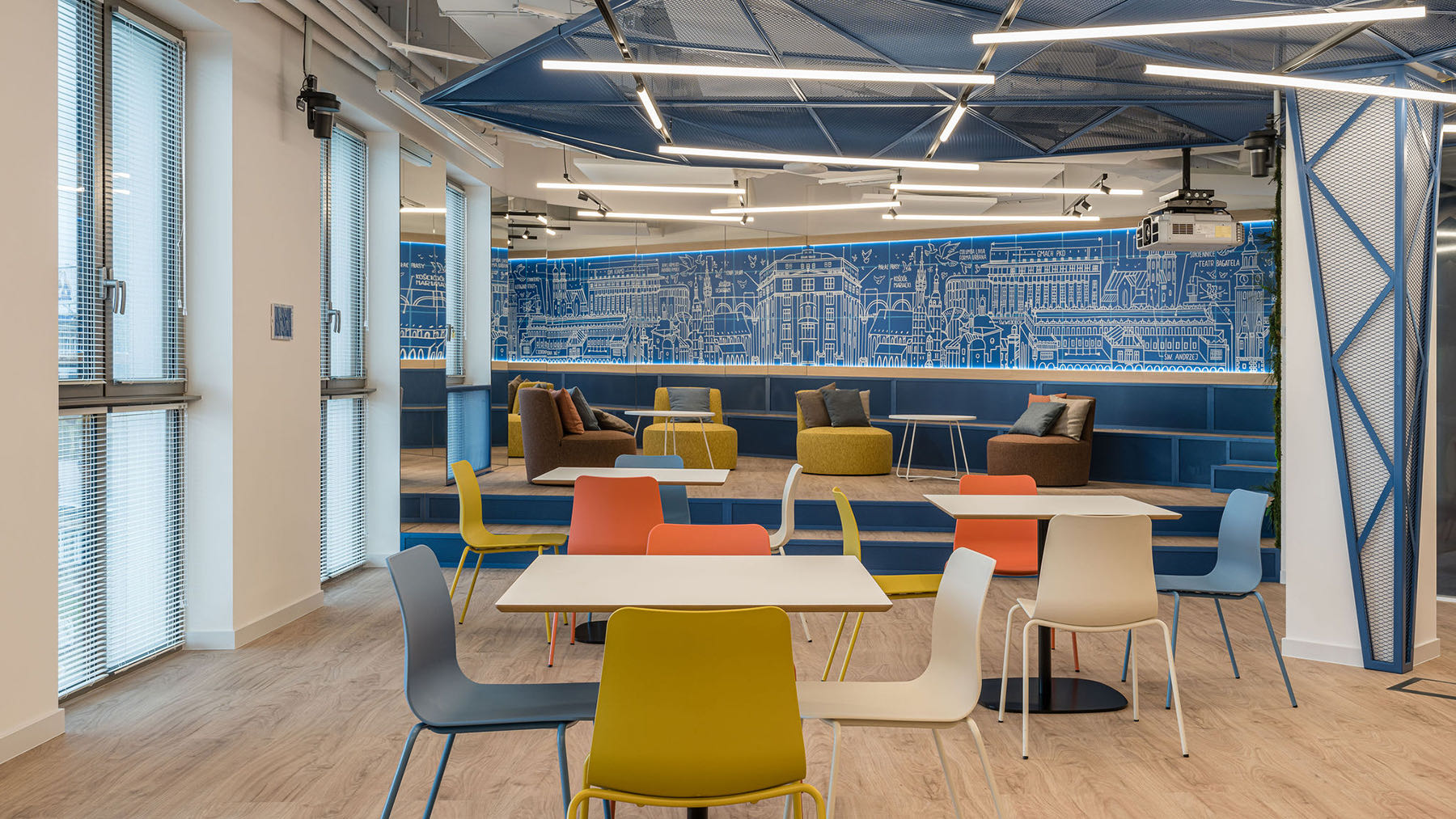
In the kitchen, there is also a mural depicting Krakow skyline, ending with a half of one of Krakow buildings. Its other half appears in the reflection of a huge mirror adjacent to it. Depending on the perspective, the whole building or only half of it may appear. On the other hand, the mirror serves to optically enlarge the kitchen and lengthen the grandstand located in it.
Moreover, The Design Group architects ensured that the space remains functional and flexible so that it responds quickly to the current needs of its users. For example, the kitchen, separated by a curtain from the chillout zone, is such a place. These two spaces can be used not only to relax or prepare and eat meals, but also to convene meetings of the entire team of the Krakow branch. For this reason, the kitchen is fitted with a projector, and if the employees wish to socialize, the veneered table can be turned into a billiard table.
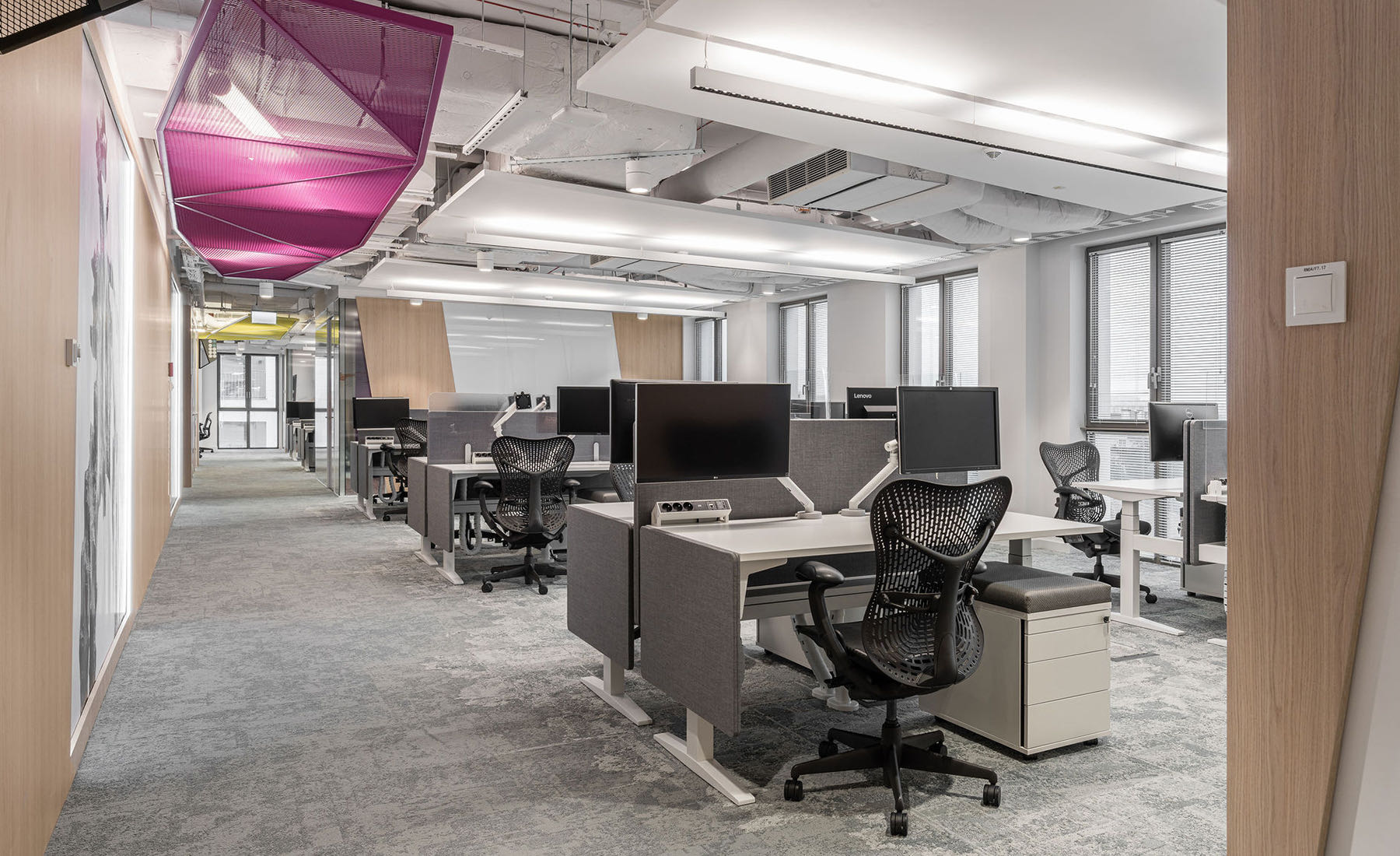
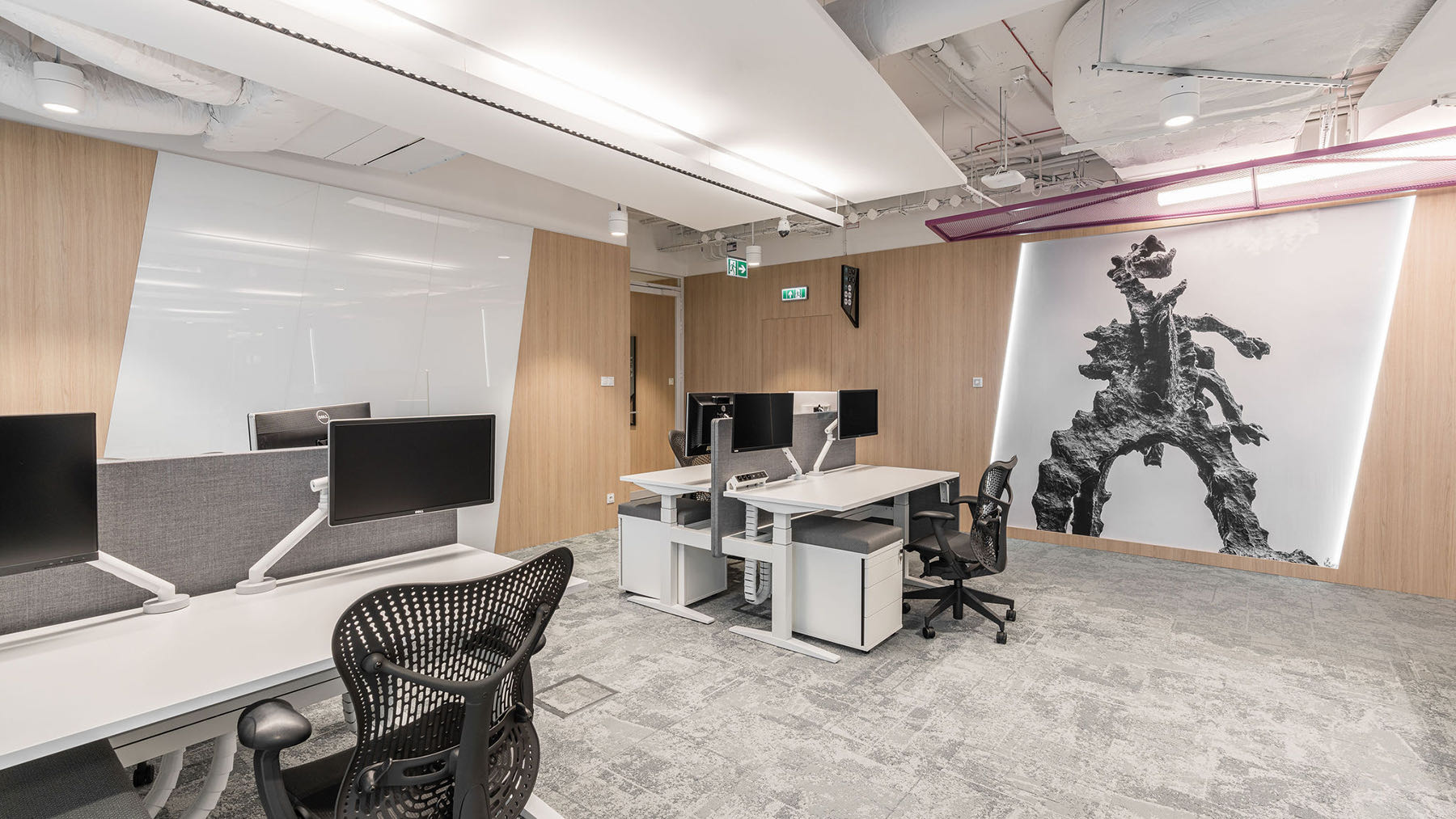
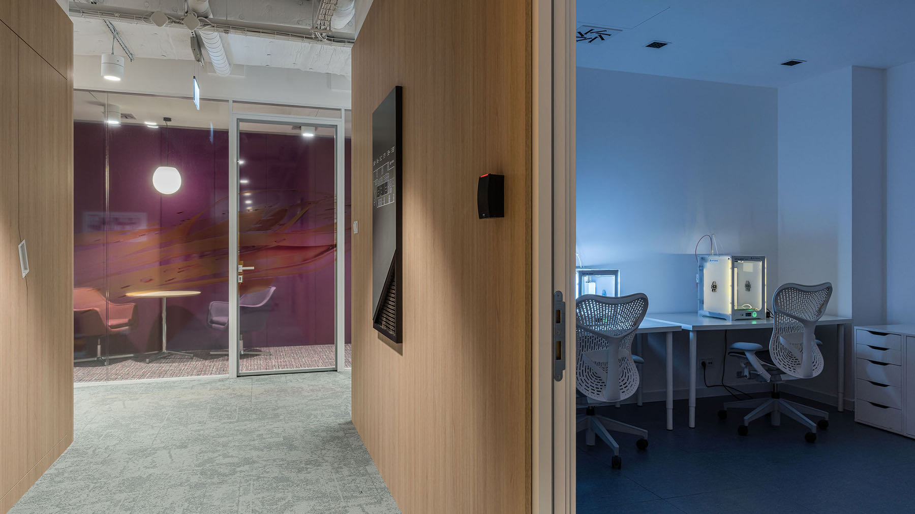
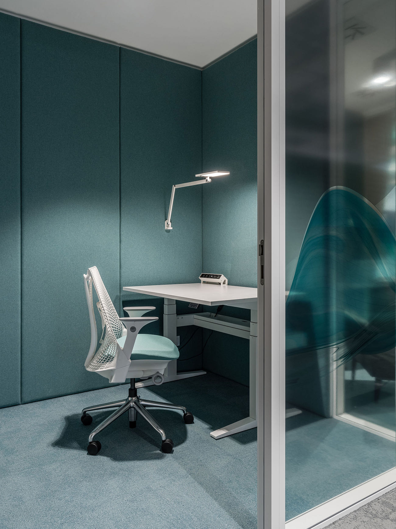
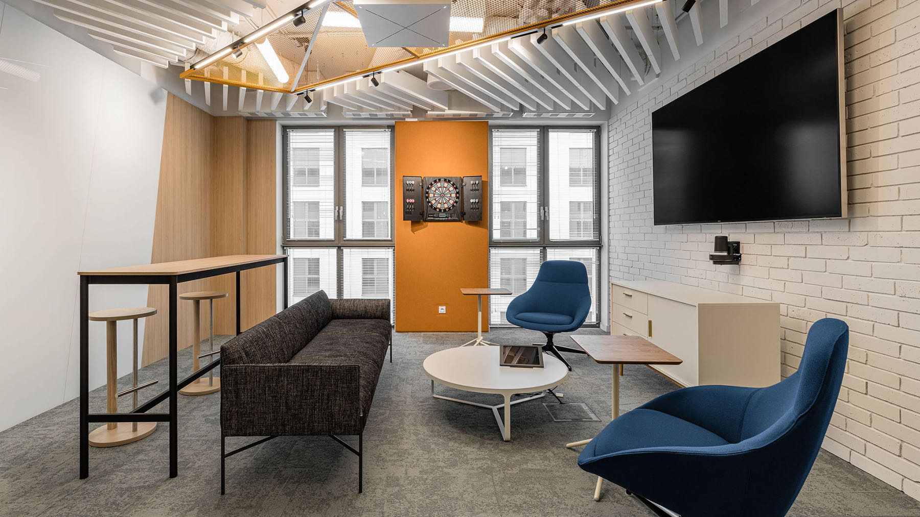
The employees use the open space, but they also have smaller and larger separate rooms at their disposal, as well as a room with a treadmill available even during business calls. Colors separate individual office rooms. On top of that, the designers separated yet another remarkable space, which they called the stream area. It is here that Autodesk employees, besides being able to regenerate on a comfortable couch or in the “wing” chairs, can discuss presentations in smaller groups, brainstorm, and put ideas on whiteboards, says The Design Group.
- Location: Krakow, Poland
- Date completed: 2020
- Size: 18,298 square feet
- Design: The Design Group
- Photos: Fotomohito
The post A Look Inside Autodesk’s Sleek New Krakow Office appeared first on Officelovin'.

