A Look Inside Dupont’s Mexico City Office
| September 27, 2021Industrial company Dupont hired architecture & interior design firm SPACE to design their new office in Mexico City, Mexico.
“The current market and its high competitiveness have forced them to consider and apply alternatives to promote creativity in the workplace (implementation of work cells, home office, outsourcing, trainees, etc) which is why they need early talent attraction & retention plans. This arquitectural project enforced a process of strategic stacking per area that would improve the service along with the product, creating an adequate working environment with constant IT update to optimize every work session.
“Vive mejor” is a mandatory practice for every area that conforms Dupont. Communication between areas is fundamental to achieve the highest business performance possible. When faced with a chain operation such as Dupont’s, the full understanding of the ‘whats’, the ‘whens’, and the ‘whys’ of every single operation are beyond essential.
Dupont’s core value is people, which is why a variety of solutions are considered to fully satisfy the different necessities of their different communities.
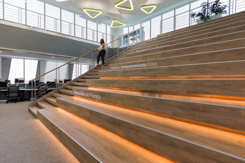
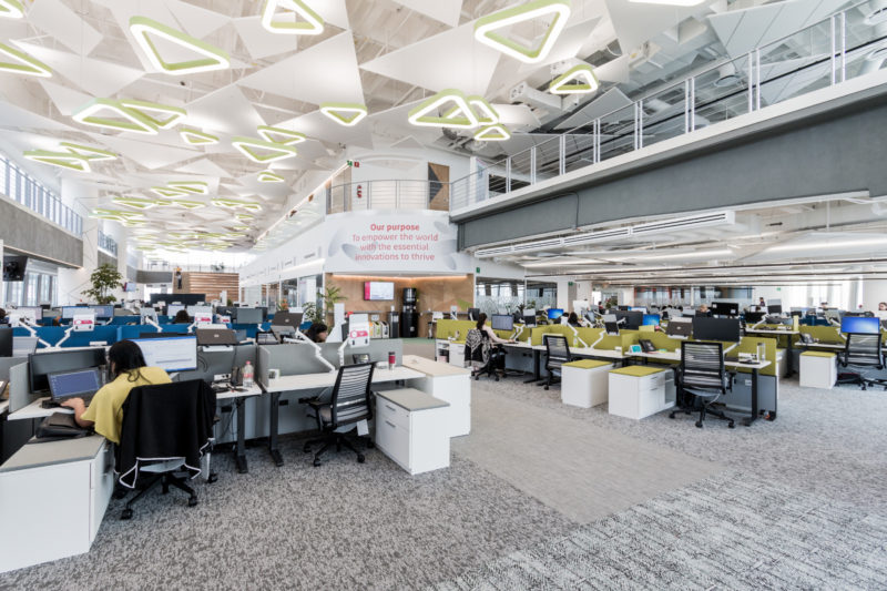
The design was based on a fresh architectural trend that encompasses natural lighting, attractive, confortable, all equipped and well exploited spaces that build and increase the sensation of happiness. Work positions were standardized to achieve flexible and functional realignments with more assembly areas, a more contemporary all-round image, less personal storage space, and more archive zones per area.
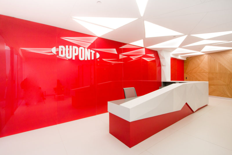
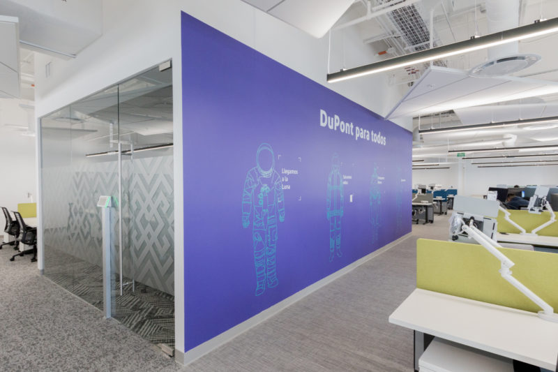
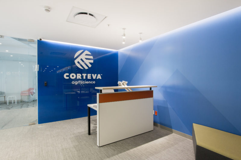
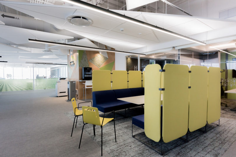
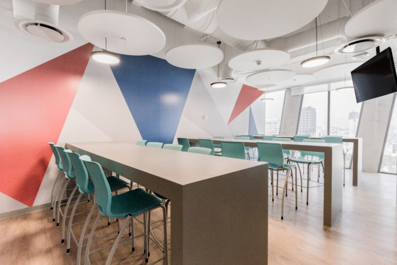
The distribution of areas and work cells was planned to achieve more efficiency and logic in overall performance, incorporating new spaces (relaxation, collaboration, focus, etc) to allow users a wide range of options to choose from when trying to exercise their activities the best way possible.The aim was to create a space where the external values and experiences sold through their different products, could be transmitted in-house. Starting from the reception area, where the main function is transmitting the company’s philosophy within collaborators, the people they’re in touch with or people accessing the facilities. A red and white scenery representing the strong corporate consolidation along with the usage of triangles as a symbol of its structure, strength and order, refer to its interdisciplinary unification that grows stronger and more efficient every time.
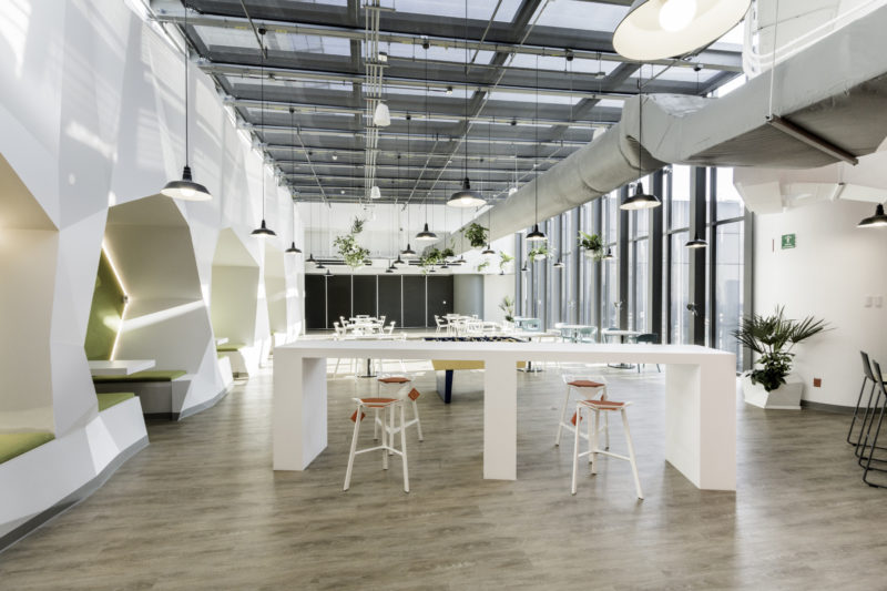
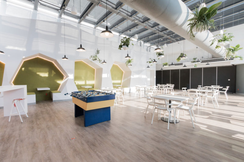
Dupont is a working environment with natural lighting and pleasant temperature, with transparent walls that favor supervision and collaboration; a modern space, functional and efficient that reflects Dupont’s corporate concept. With leisure spaces within everyone’s reach, including a wide and enjoyable dining area that reflects the quality of life that is promoted in-house, the dynamics of an enterprise with technology and innovation pillars are evident first-hand”.
- Location: Mexico City, Mexico
- Date completed: May 2020
- Size: 69,000 square feet
- Design: SPACE
- Photos: Crysel Bravo
The post A Look Inside Dupont’s Mexico City Office appeared first on Officelovin'.

