Clariant Offices – Lodz
| July 8, 2020The Design Group delivered the design for the offices of Swiss chemical company, Clariant, located in Lodz, Poland.
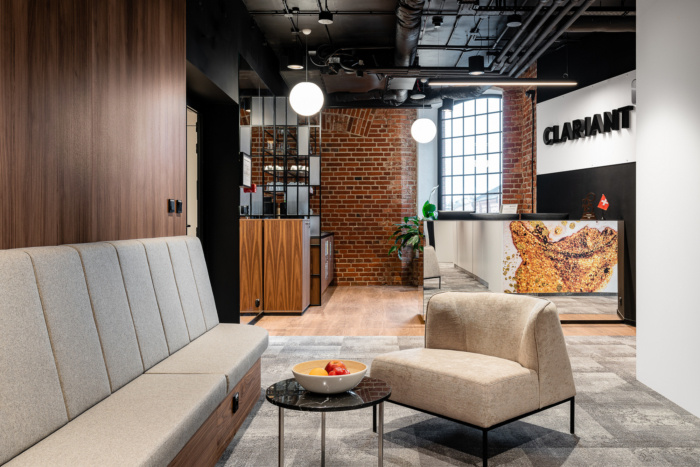
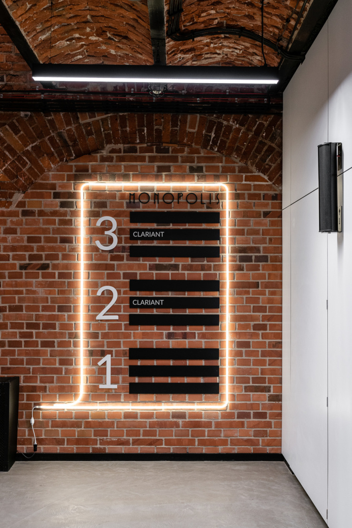
In the Łódź Monopolis, as that is where the Clariant Shared Service Center is seated, people from different parts of the world find employment. The center provides services to customers from Europe, the Middle East, Africa, and South America. Overall, the center employs over 300 persons from 20 countries. This inspiring office interior was designed for them by The Design Group designers, and it is a smart combination of the antique fabric of Monopolis, Clariant’s values, and the latest technological solutions.
Industrial climate
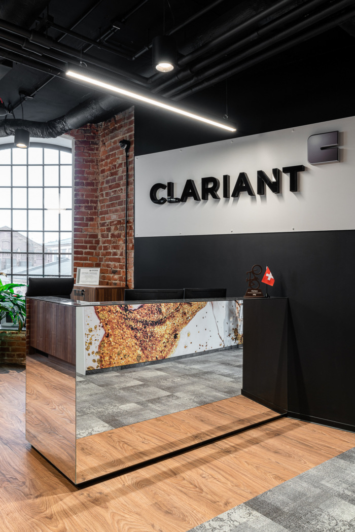
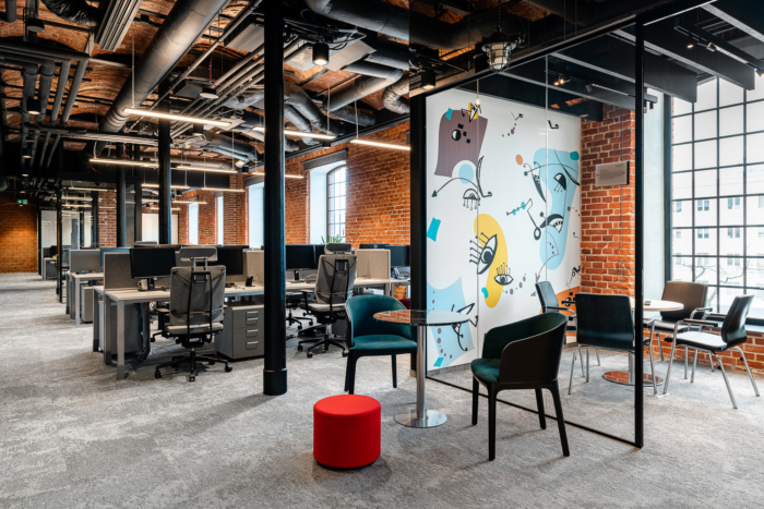
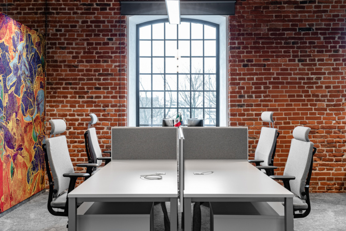
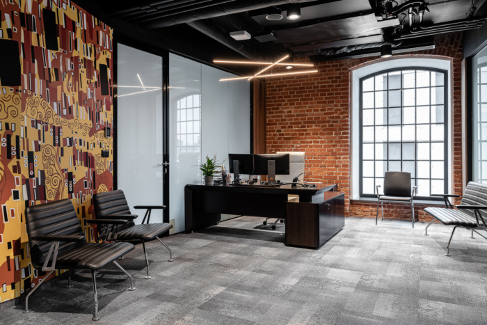
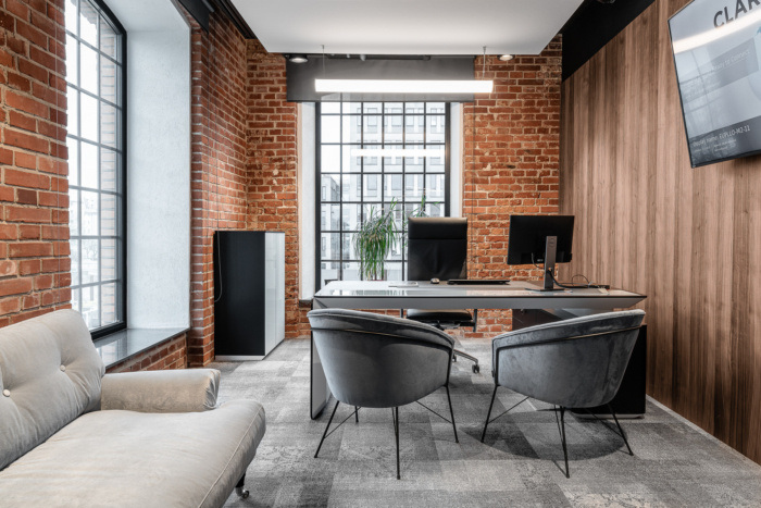
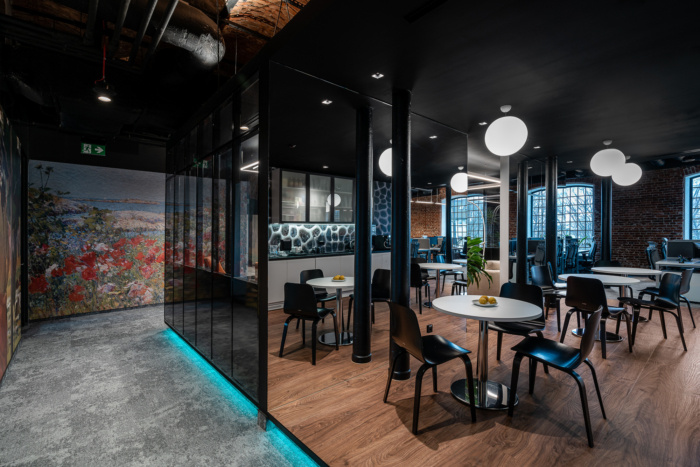
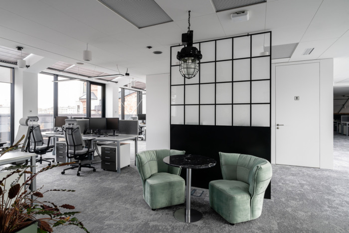
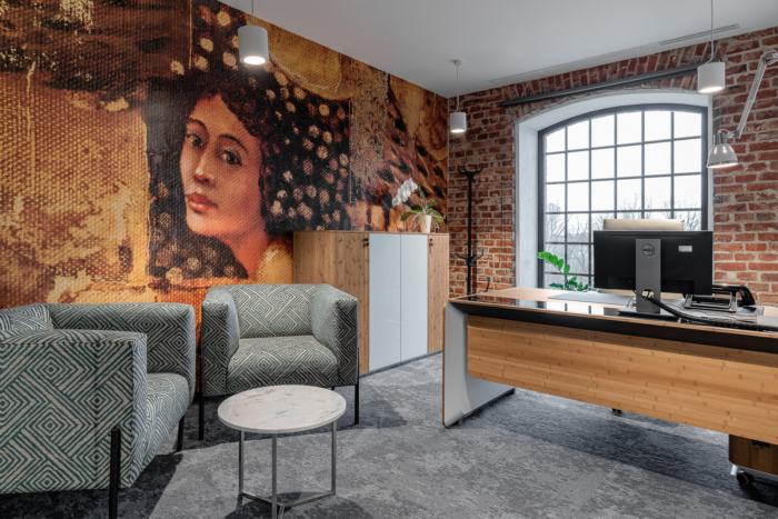
The Clariant office occupies two floors, totaling over 4,300 m2. The office is spacious and, first and foremost, functional. Original, cast-iron stairs lead to the company’s seat, featuring preserved embossing, which still recalls the beginnings of the Vodka Manufactory. They accentuate the atmosphere of this place and lend it a classy feeling. Similarly, The Design Group architects did not avoid references to post-industrial aesthetics in the office interiors. The brick, which you can see on many walls, is an original part of this over 100-year-old building. Its display was a deliberate design effort. Besides, there are mirrors concealed in various parts of the office (from the height of 2.7 m to the ceiling, i.e. up to about 4 m), which create the effect of never-ending masonry and incredible depth. The ceiling, which resembles a barrel vault, is loaded with illuminating reflectors, along with acoustic systems as acoustic islands and sheets (acoustic beams) tailored to this area.Three key features
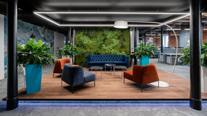
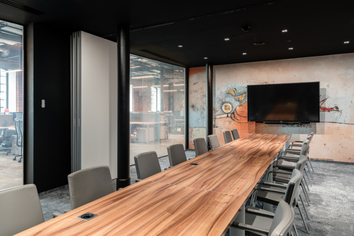
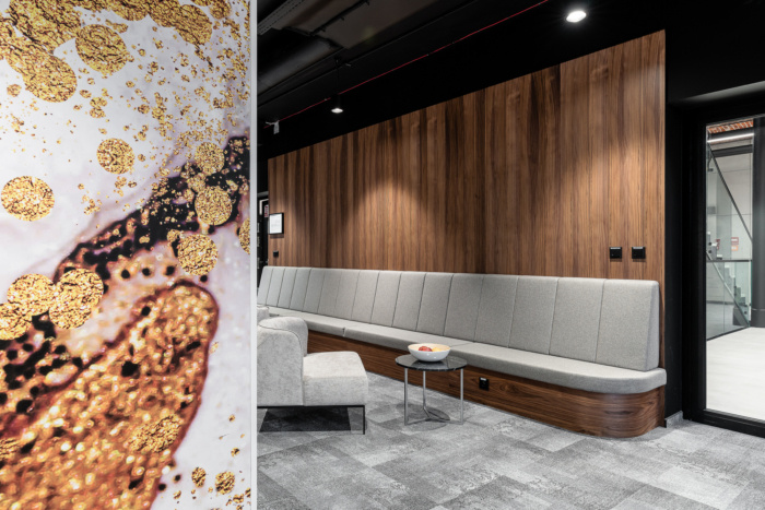
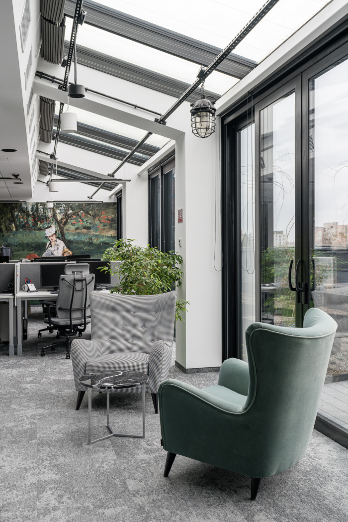
The industrial atmosphere of the office, with its aesthetics dominated by the said bricks, soft colors, and wooden veneer, is interrupted by a number of distinctive architectural interventions. The first one, which is extremely representative for those interiors, are the photo wallpapers, featuring for instance reproductions of pieces by prominent painters. Altogether, there are nearly 80 of such reproductions. Each of them refers to one of Clariant’s six main values. The print ideas presented by Clariant have been tested by TDG in terms of aesthetics and integration into the building structure. The greenery is another design element making these interiors stand out, introduced there as a so-called living wall. Not only is its function to decorate, but above all to purify the air.Functional and safe
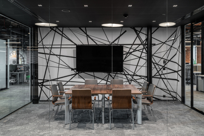
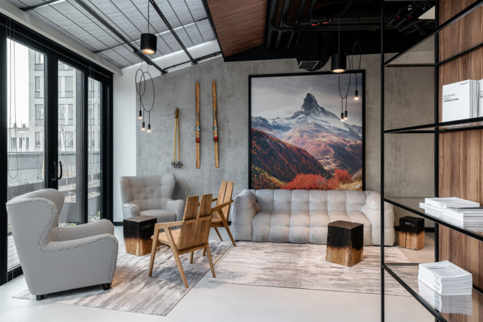
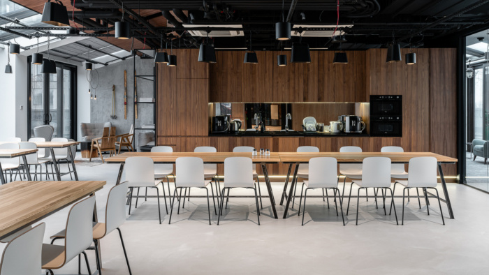
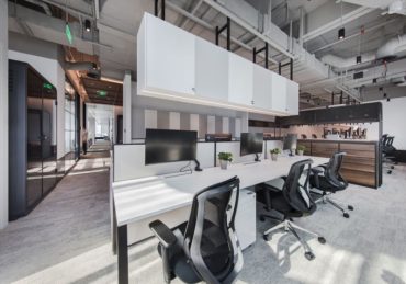
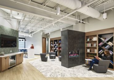
The ambience of the Clariant office in Łódź is literally and figuratively open. Employees predominantly occupy the open space, and individual offices are separated by glass walls. There are also numerous conference rooms, leisure areas, and coffee points. The company has also minded providing silent rooms, i.e. small, glazed “telephone booths.” The good, but most importantly, safe office experience is fostered by advanced health and safety solutions, such as projectors with information about low ceilings, or a safe door handle system that warns with color signals when a bathroom door opens onto the hallway.The Clariant Shared Service Center is undoubtedly a metonym for modernity and for the highest standards of architecture for this type of space. Yet, it does not lose its entrepreneurial spirit; indeed, the said spirit is shaped by the history of Monopolis, and by the value of this Swiss brand. These aspects were emphasized by Konrad Krusiewicz’s design team – The Design Group. The end result is bound to receive recognition.
Design: The Design Group
Photography: Fotomohito
The post Clariant Offices – Lodz appeared first on Office Snapshots.

