Inside I.T Ceramiche’s New Foshan Office
| October 13, 2020Ceramic tile manufacturer I.T Ceramiche hired interior design firm Foshan Topway Design to design their new office in Foshan, China.
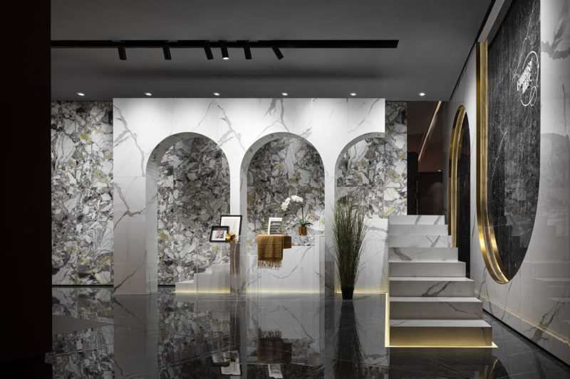
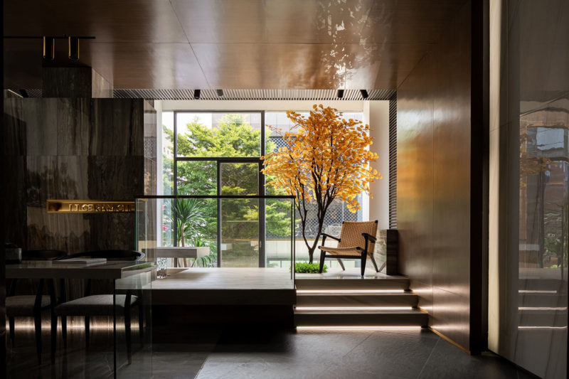
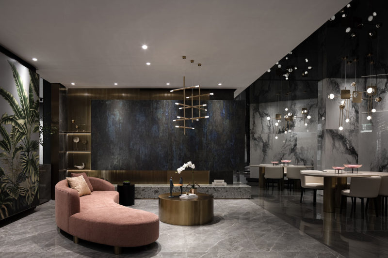
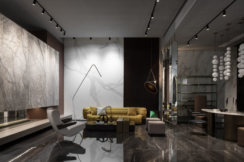
“The design intends to blend Italian living aesthetics that features natural comfortableness, artistic taste and affordable luxury into oriental context, to endow the brand with unique romantic and artistic charm. 1F and 2Ffunction as product display, reception and leisure spaces, while 3F and 4F are used for working and logistics purposes.
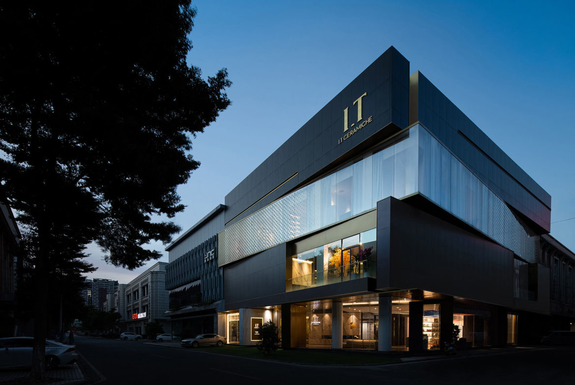
The building is a four-storey construction. The architectural appearance is inspired by the popular “Rubik’s Cube”. Each floor is a box, which interactively rotates, together creating a twisting form that shows contradictory yet interdependent visual effects and highlights the mechanical beauty of the building blocks. Plain, heavy and dark cement bricks offer a strong visual contrast to the light transparent glass box, making the building “boxes” appear suspended in the air. The contrast between black and white, lightness and heaviness, void and solidness, together with the free plane and facade design, contributes to producing changes to the architectural form. The harmonious combination of brass metal and dark gray terrazzo, colored acrylic glass and marbles, as well as artificial synthetic materials and traditional natural materials, perfectly demonstrates the brand’s sense of affordable luxury, ultimate craftsmanship and aesthetic concept.
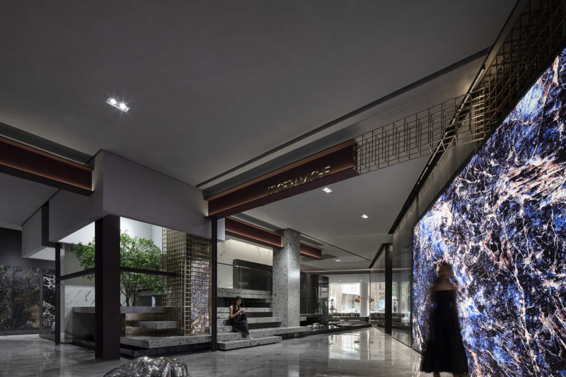
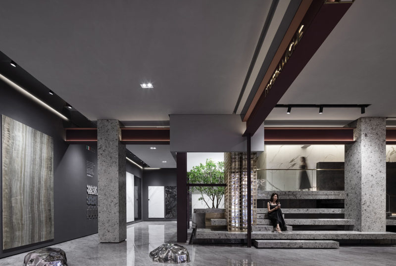
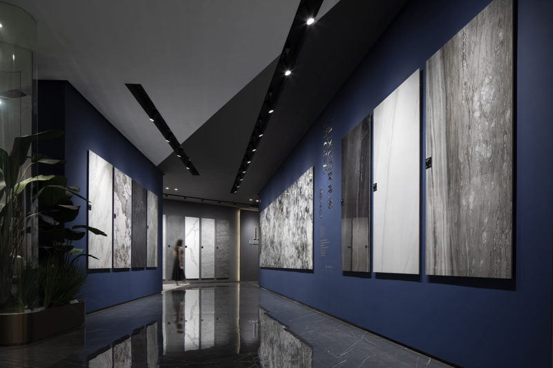
The concept of “Cube” is extended to the interior design, which creates free yet contrasting spatial forms. At the lobby, the ceiling is finished with a stainless steel panel featuring rippling patterns, which create a feeling of being underwater. The rotating wall and ceiling are connected and interpenetrated via blocks, giving the space a strong sense of architectural blocks. The luxurious pink stone and the cement-like flooring form a sharp contrast, while accentuating their own unique textures. Visitors can appreciate different views at each step along the circulation route. The core of this free space is that it never restricts people’s behaviors. Instead, it guides them to walk and explore under the “rippling water”. The poetic design language enables the architectural space to resonate with inner mind.
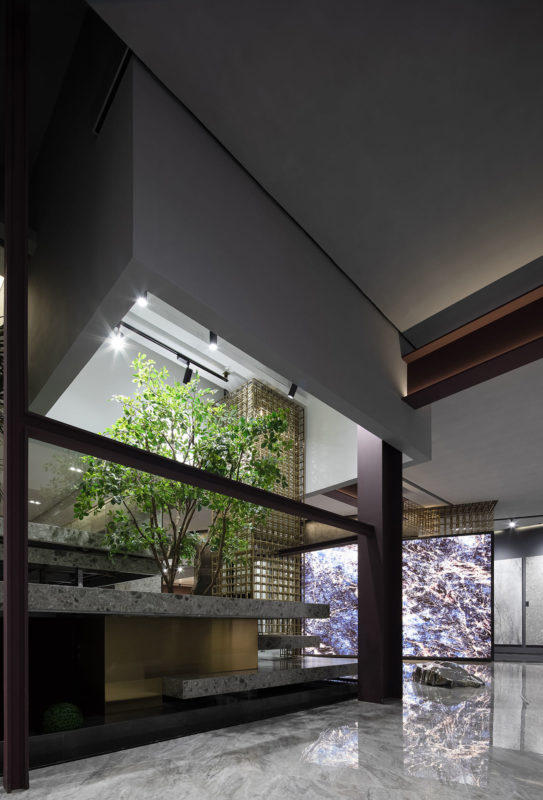
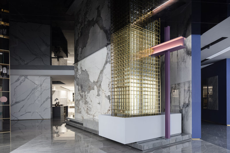
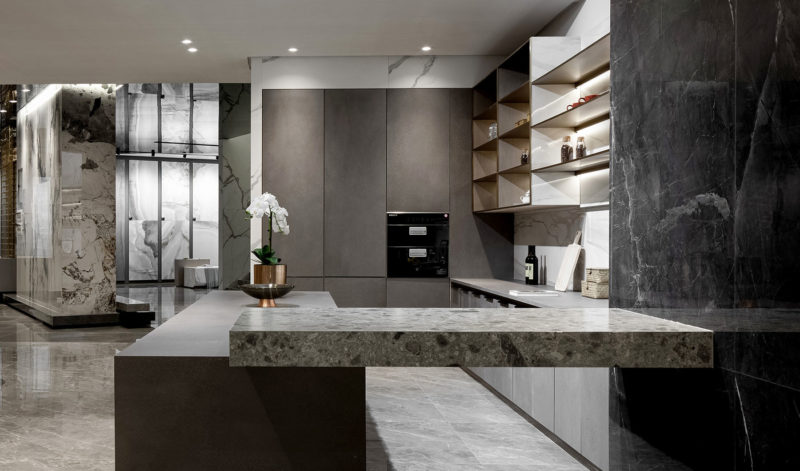
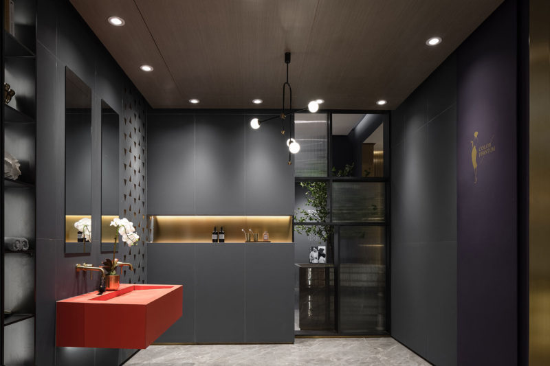
The 3 columns of different sizes in the space seem to gradually peel off the coverings of the building, creating strong visual effects and leading people into philosophical thinking: What is real perfection?The design emphasizes the collision among materials of different textures. Polished terrazzo, exquisite marbles and rusting universal beams, either smooth or rough, cool or warm, are applied to constructing the space by means of contrast, analogy, symbiosis, repetition and order, etc. The column at the center is integrated with metal, aluminum and glass to form a new architectural and visual element. Such combination embodies an exploration of sustainable materials and an inheritance of modernism. Design is more than superficial decoration, but more importantly should explore and bring more possibilities of internal reconstruction,” says Foshan Topway Design.
- Location: Foshan, China
- Date completed: October 2019
- Size: 19,375 square feet
- Design: Foshan Topway Design
- Photos: Ouyang Yun


The post Inside I.T Ceramiche’s New Foshan Office appeared first on Officelovin'.

