MinterEllison Offices – Melbourne
| September 27, 2022Carr designed a sleek and modern space with strong materials and soft finishes for the MinterEllison offices in Melbourne, Australia.
Carr began working on the project in 2015, undertaking extensive briefing and collaboration with the MinterEllison team. The process involved several steering committees to develop a strong design response. The key aspirations to come out of the briefing phase were to have a workplace that is functional, adaptive, diverse, human-centred, inspiring, collaborative, innovative and timeless. Within this framework, was a desire to have a workplace that is authentic and welcoming, while being memorable.
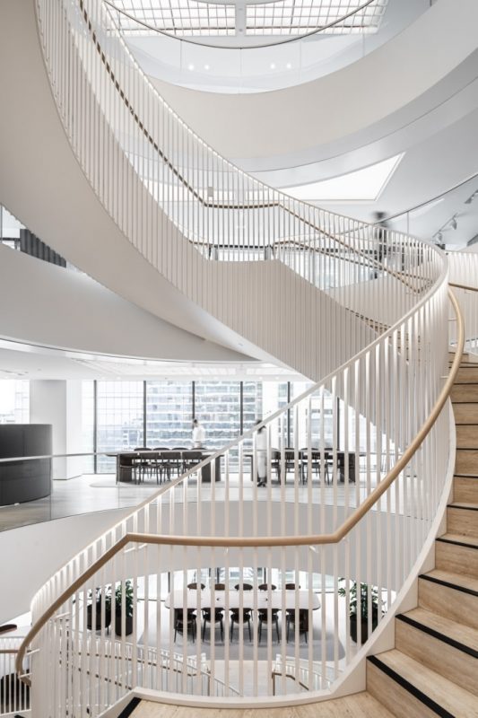
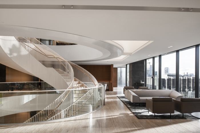
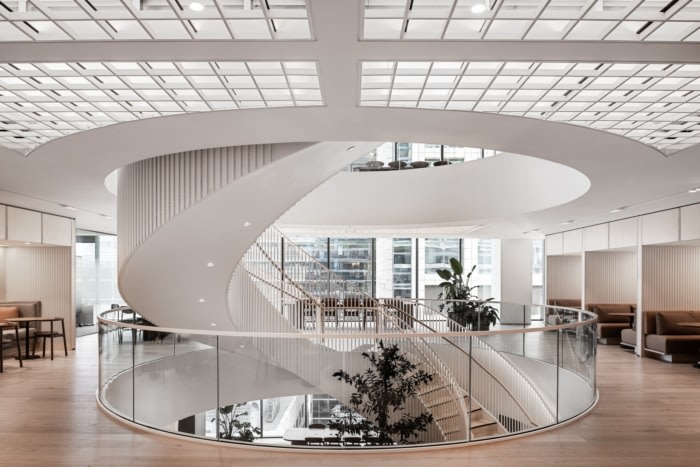
The client desired, “architectural elements that are functional but statement worthy,” says Associate Molly Shelton. A luminous central stair is where this thinking shines, adding a sense of scale and drama. The final curved form was chosen for its softness and the way it links different views across different aspects on each floor. Viewed as a continuous run without a break, the complete helix form creates a clear and consistent connection across all the floors.
Despite its large scale, the stair invites a gentle and welcoming journey, designed with shallow risers. It appears lightweight, like a flowing ribbon coming down from the stretched barrisol ceiling above.
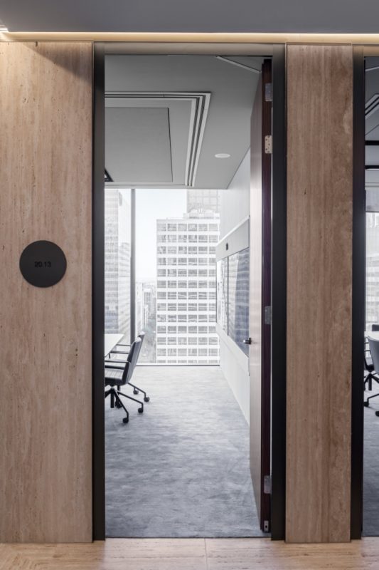
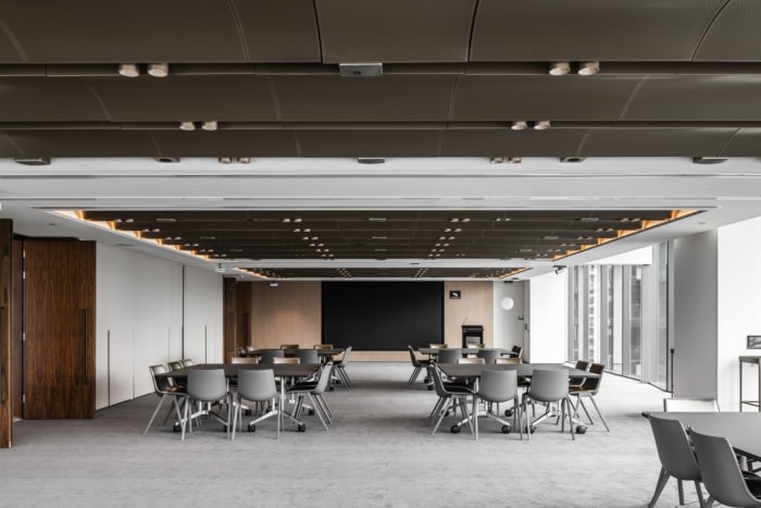
Place and context evolved as central themes, which emerged in the spatial planning and materiality. Located on floors 17-22 of Collins Arch, the site offers two very distinct views, an intimate aspect to Collins Street, and an expansive view over Flinders Lane and across the Yarra River. Respecting these two viewpoints, the layout consciously pairs each aspect with a relative function – small scale, intimate meeting spaces are located to the intimate side of the floorplate, while the large seminar rooms take in the broad views out across the Yarra River. Within the seminar rooms, the Yarra River is referenced through the organic patterning of the carpet and the curving, coffered ceiling.
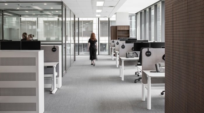
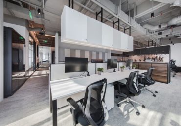
The layout and spatial planning of the work floors uses a hybrid methodology, drawing reference to the famous Hoddle Grid of Melbourne with a functional, neighbourhood-style of planning. Pavilions and corridors break down the built form, while transparency and glazing maintain sight lines out to the views, an important consideration to create a sense of connectivity across the work floor. The design plays between the gridded planning and the curving organic form of the stair.
The practice has built an impressive artwork collection over the years, something that is unique to Melbourne. Part of the brief was integrating the artwork in a meaningful way, showing a continuity from the old office to the new one. Timelessness, quality and endurance are expressed through the reuse of iconic furniture.
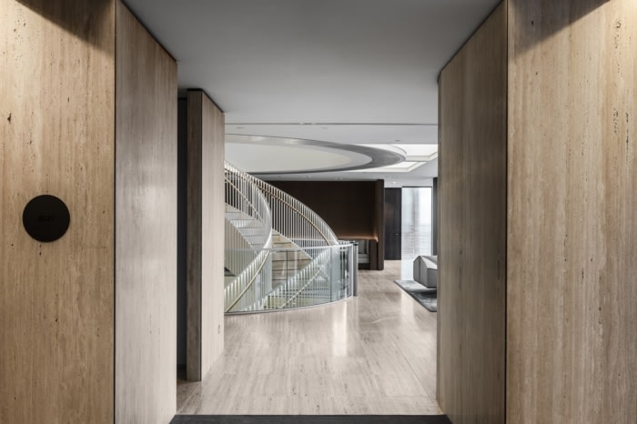
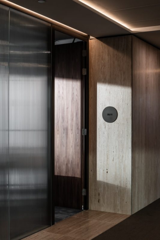
Materiality not only aligns with the MinterEllison brand and the aspirational brief, but also to the concept of ‘Melbourne’. The palette is neutral and subtle, bringing a timeless sophistication that feels welcoming. Natural, unfilled travertine stone is a stand-out feature used throughout all the key client spaces including the reception and meeting rooms. The dining room also draw on the history of Melbourne with the use of Harcourt granite, while the hessian light boxes are inspired by the Western Market that operated on the site for over a century before it was developed.
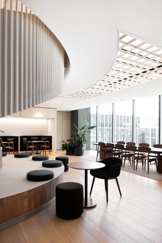
Several design details offer a sense of consistency and harmonious repetition, even if not overtly obvious. For example, moving through the client floor to the front of house meeting rooms ribbed glass wraps the façade, bringing a strong vertical element that is repeated in the stair detailing and also in the stone. Adding a sense of visual variety, the breakout spaces on each level have a different colour scheme, creating diversity and breaking down the scale of such a large project. A thorough planting scheme has also been integrated, bringing greenery and life throughout the office.
The new MinterEllison office deeply embodies the law firm and its significant history within the city of Melbourne. With thorough briefing, research and collaboration, MinterEllison’s workplace will see them into the future through a timeless, approachable and sophisticated design.
Design: Carr
Photography: Tom Blachford
The post MinterEllison Offices – Melbourne appeared first on Office Snapshots.

