Tompkins Wake Offices – Auckland
| December 8, 2022STACK designed a sophisticated and and thoughtful layout for the Tompkins Wake offices in Auckland, New Zealand.
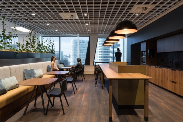
The brief for Tompkins Wake’s new workplace was to deliver a high-end, premium space that enhanced the client experience while providing an efficient and modern working environment. The design response was not only about creating a space that embraced the Tompkins Wake brand but also designing a multi-functional space for clients and staff. The fitout provided an opportunity to showcase the company’s identity and embrace a timeless, refined and modern design approach.
The overall concept was inspired by Tompkins Wake’s branding and culture, while brand elements were the main drivers of the design concept. The design emphasised Tompkins Wake’s desire to build on an established reputation while creating a workplace and ethos that is innovative and forward thinking.
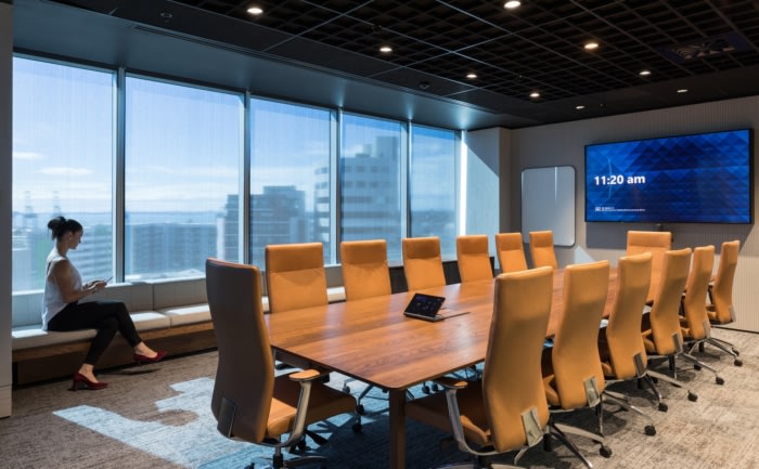
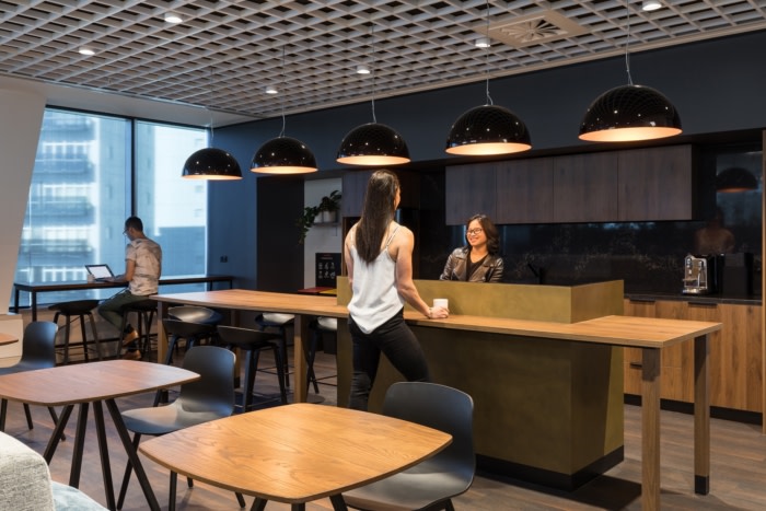
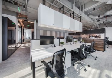
A key consideration was to re-examine the layout of the traditional law firm and explore the way visitors and clients experience Tompkins Wake’s brand from a visual and functional perspective. The process involved working with Tompkins Wake’s team to re-evaluate their ways of working and established effective systems to enhance the environment for a variety of different working styles. The layout created multifunctional zones allowing for collaboration with clients and a hybrid, flexible workforce.
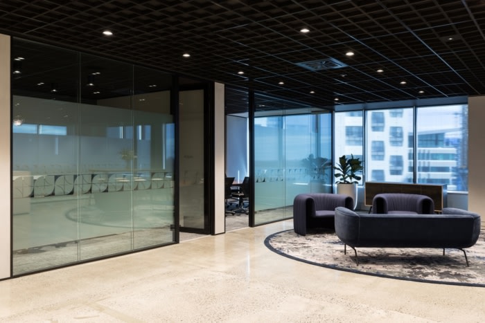
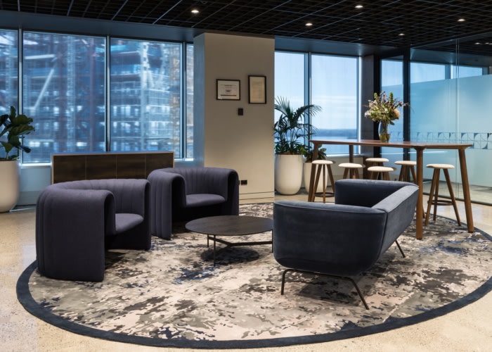
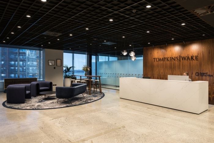
The front-of-house arrival sets the tone of trust and professionalism and is unique to the brand and values of Tompkins Wake, and has been designed to be multi-use for traditional meet and greets, hosting events and casual meetings. Key moments, such as arrival into the space, become signature experiences connecting staff and clients to the culture and purpose of the firm. This multi-use front of house demonstrates a shift in space utilisation and a focus on shared spaces. Given the nature of Tomkins Wake’s business and visitors, a conservative design approach was called for in terms of privacy, confidentiality and workflow.
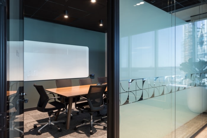
The concept of an ‘open book’ was expressed using curved walls, representing a warm welcome and providing a smooth flow into the arrival area. The idea of ‘a light bulb moment’ became the feature light at the reception, reflecting ideas and innovation. These two elements were combined, signifying creativity, wisdom and knowledge, and became a graphic representation that was used and installed on all glazing partitions as a privacy pattern.
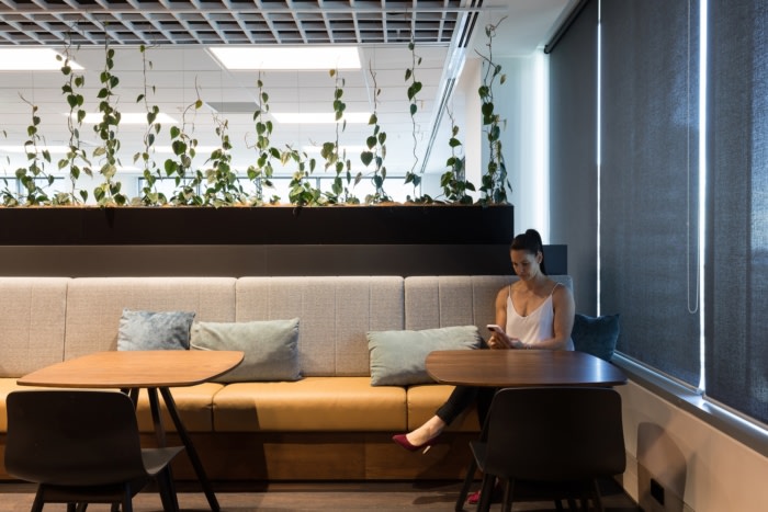
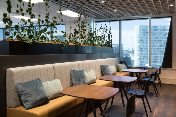
The weaving of greenery into the design tapestry provides a connection between the spaces and promotes wellness. Tompkins Wake’s brand was incorporated into the fitout allowing for an innovative design aesthetic, including modernising the logo, while still maintaining the legacy of the brand.
Design: STACK
Design Team: Maria De Jesus, David Plaistowe, Lauren Scott, Iva Parapanova, Sally Vandal
Photography: Mark Scowen
The post Tompkins Wake Offices – Auckland appeared first on Office Snapshots.

